
- Matplotlib Basics
- Matplotlib - Home
- Matplotlib - Introduction
- Matplotlib - Vs Seaborn
- Matplotlib - Environment Setup
- Matplotlib - Anaconda distribution
- Matplotlib - Jupyter Notebook
- Matplotlib - Pyplot API
- Matplotlib - Simple Plot
- Matplotlib - Saving Figures
- Matplotlib - Markers
- Matplotlib - Figures
- Matplotlib - Styles
- Matplotlib - Legends
- Matplotlib - Colors
- Matplotlib - Colormaps
- Matplotlib - Colormap Normalization
- Matplotlib - Choosing Colormaps
- Matplotlib - Colorbars
- Matplotlib - Text
- Matplotlib - Text properties
- Matplotlib - Subplot Titles
- Matplotlib - Images
- Matplotlib - Image Masking
- Matplotlib - Annotations
- Matplotlib - Arrows
- Matplotlib - Fonts
- Matplotlib - What are Fonts?
- Setting Font Properties Globally
- Matplotlib - Font Indexing
- Matplotlib - Font Properties
- Matplotlib - Scales
- Matplotlib - Linear and Logarthmic Scales
- Matplotlib - Symmetrical Logarithmic and Logit Scales
- Matplotlib - LaTeX
- Matplotlib - What is LaTeX?
- Matplotlib - LaTeX for Mathematical Expressions
- Matplotlib - LaTeX Text Formatting in Annotations
- Matplotlib - PostScript
- Enabling LaTex Rendering in Annotations
- Matplotlib - Mathematical Expressions
- Matplotlib - Animations
- Matplotlib - Artists
- Matplotlib - Styling with Cycler
- Matplotlib - Paths
- Matplotlib - Path Effects
- Matplotlib - Transforms
- Matplotlib - Ticks and Tick Labels
- Matplotlib - Radian Ticks
- Matplotlib - Dateticks
- Matplotlib - Tick Formatters
- Matplotlib - Tick Locators
- Matplotlib - Axis Ranges
- Matplotlib - Axis Scales
- Matplotlib - Axis Ticks
- Matplotlib - Formatting Axes
- Matplotlib - Axes Class
- Matplotlib - Twin Axes
- Matplotlib - Figure Class
- Matplotlib - Multiplots
- Matplotlib - Grids
- Matplotlib - Object-oriented Interface
- Matplotlib - PyLab module
- Matplotlib - Subplots() Function
- Matplotlib - Subplot2grid() Function
- Matplotlib - Anchored Artists
- Matplotlib - Manual Contour
- Matplotlib - Coords Report
- Matplotlib - AGG filter
- Matplotlib - Ribbon Box
- Matplotlib - Fill Spiral
- Matplotlib - Findobj Demo
- Matplotlib - Hyperlinks
- Matplotlib - Image Thumbnail
- Matplotlib - Plotting with Keywords
- Matplotlib - Create Logo
- Matplotlib - Multipage PDF
- Matplotlib - Multiprocessing
- Matplotlib - Print Stdout
- Matplotlib - Compound Path
- Matplotlib - Sankey Class
- Matplotlib - MRI with EEG
- Matplotlib - Stylesheets
- Matplotlib - Background Colors
- Matplotlib - Basemap
- Matplotlib Event Handling
- Matplotlib - Event Handling
- Matplotlib - Close Event
- Matplotlib - Mouse Move
- Matplotlib - Click Events
- Matplotlib - Scroll Event
- Matplotlib - Keypress Event
- Matplotlib - Pick Event
- Matplotlib - Looking Glass
- Matplotlib - Path Editor
- Matplotlib - Poly Editor
- Matplotlib - Timers
- Matplotlib - Viewlims
- Matplotlib - Zoom Window
- Matplotlib Plotting
- Matplotlib - Bar Graphs
- Matplotlib - Histogram
- Matplotlib - Pie Chart
- Matplotlib - Scatter Plot
- Matplotlib - Box Plot
- Matplotlib - Violin Plot
- Matplotlib - Contour Plot
- Matplotlib - 3D Plotting
- Matplotlib - 3D Contours
- Matplotlib - 3D Wireframe Plot
- Matplotlib - 3D Surface Plot
- Matplotlib - Quiver Plot
- Matplotlib Useful Resources
- Matplotlib - Quick Guide
- Matplotlib - Useful Resources
- Matplotlib - Discussion
Matplotlib - 3D Plotting
A 3D plotting is a way to represent three dimensional data in a graphical format. It allows you to visualize the information in three spatial dimensions, represented as X, Y, and Z coordinates. In 3D plots, data points are not only located on a flat plane but also have depth, creating a more detailed representation of the dataset.
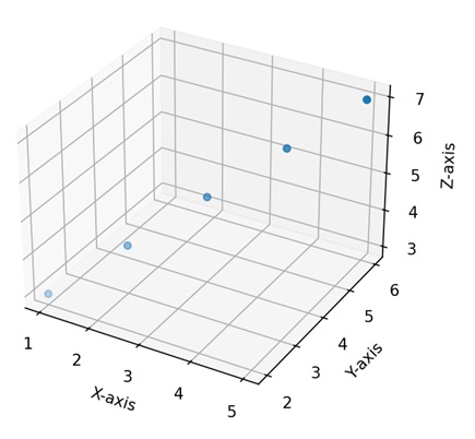
3D Plotting in Matplotlib
In Matplotlib, we can create a three-dimensional plot using the mpl_toolkits.mplot3d module. This module provides tools to create three-dimensional visualizations, including scatter plots, line plots, surface plots, and more. These plots provide a way to represent and explore data points or mathematical functions in three-dimensional space. You can customize aspects such as color, markers, labels, and perspective to convey information more effectively.
We can integrate the numpy library with the mpl_toolkits.mplot3d module to generate multidimensional data, and different functions, such as scatter, plot_surface, or plot_wireframe.
The mpl_toolkits.mplot3d Module
The "mpl_toolkits.mplot3d" module in Matplotlib enhances the library's capabilities for three-dimensional plotting. It introduces the "Axes3D" class, which enables the creation of 3D subplots. This module facilitates the visualization of data in three dimensions through functions such as scatter() for 3D scatter plots, plot_surface() for surface plots, and plot_wireframe() for wireframe representations.
3D Scatter Plot
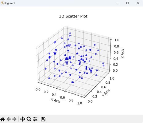
A 3D scatter plot in Matplotlib is a visualization where data points are represented as individual markers in a three-dimensional space. Each data point is defined by three values, corresponding to its positions along the X, Y, and Z axes. These axes create a three-dimensional grid, and each marker is placed at the specified coordinates in this space. We can create this type of plot using the scatter() function.
Example
In the following example, we are generating random 3D data points using NumPy and creating a 3D scatter plot with blue markers. We display the plot in a three-dimensional space, where the x, y, and z axes represent the coordinates of the points −
import matplotlib.pyplot as plt
from mpl_toolkits.mplot3d import Axes3D
import numpy as np

# Generating random 3D data
np.random.seed(42)
n_points = 100
x = np.random.rand(n_points)
y = np.random.rand(n_points)
z = np.random.rand(n_points)

# Creating a 3D scatter plot
fig = plt.figure()
ax = fig.add_subplot(111, projection='3d')
ax.scatter(x, y, z, c='blue', marker='o')

ax.set_xlabel('X Axis')
ax.set_ylabel('Y Axis')
ax.set_zlabel('Z Axis')
ax.set_title('3D Scatter Plot')
plt.show()
Output
The resulting plot shows a gradual color transition under the curve −
3D Line Plot
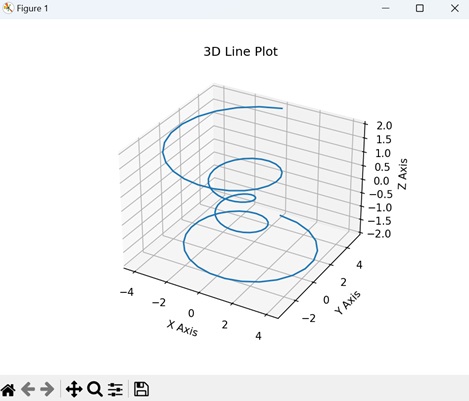
A 3D line plot in Matplotlib is a graphical representation that shows the connection between a sequence of points in a three-dimensional space. Unlike traditional 2D line plots where points are connected on a flat plane, a 3D line plot extends into three dimensions, forming a continuous line in the X, Y, and Z axes.
We can create 3D line plot in matplotlib using the plot() function. When we use this function in conjunction with the projection='3d' setting, it enables the generation of 3D line plots.
Example
In here, we are generating data for a 3D line plot by defining coordinates (x, y, and z) based on a parameterized equation. The resulting plot displays a helical shape in three-dimensional space. The x, y, and z axes represent the respective coordinates −
import matplotlib.pyplot as plt
from mpl_toolkits.mplot3d import Axes3D
import numpy as np

# Generating data for a 3D line plot
theta = np.linspace(-4 * np.pi, 4 * np.pi, 100)
z = np.linspace(-2, 2, 100)
r = z**2 + 1
x = r * np.sin(theta)
y = r * np.cos(theta)

# Creating a 3D line plot
fig = plt.figure()
ax = fig.add_subplot(111, projection='3d')
ax.plot(x, y, z, label='3D Line Plot')

ax.set_xlabel('X Axis')
ax.set_ylabel('Y Axis')
ax.set_zlabel('Z Axis')
ax.set_title('3D Line Plot')
plt.show()
Output
On executing the above code we will get the following output −
3D Surface Plot
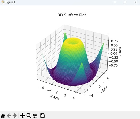
A 3D surface plot in Matplotlib is a visual representation of a mathematical function or a dataset in three-dimensional space. Instead of using flat lines or markers, this plot uses a continuous surface to show how a variable changes across two input dimensions (X and Y) and is dependent on a third dimension (Z). We can create this type of plot using the plot_surface() function.
Example
In here, we are generating data for a 3D surface plot by calculating the sine of the Euclidean distance from the origin for each point on a grid. The resulting plot visualizes a surface that rises and falls based on the sine function. The x, y, and z axes represent the coordinates and the height of the surface −
import matplotlib.pyplot as plt
from mpl_toolkits.mplot3d import Axes3D
import numpy as np

# Generating data for a 3D surface plot
x = np.linspace(-5, 5, 100)
y = np.linspace(-5, 5, 100)
x, y = np.meshgrid(x, y)
z = np.sin(np.sqrt(x**2 + y**2))

# Creating a 3D surface plot
fig = plt.figure()
ax = fig.add_subplot(111, projection='3d')
ax.plot_surface(x, y, z, cmap='viridis')

ax.set_xlabel('X Axis')
ax.set_ylabel('Y Axis')
ax.set_zlabel('Z Axis')
ax.set_title('3D Surface Plot')
plt.show()
Output
On executing the above code we will get the following output −
3D Bar Plot
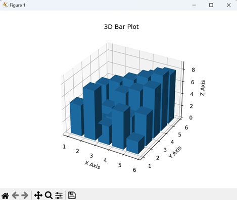
A 3D bar plot in Matplotlib is a visual representation where data is presented using rectangular bars in three-dimensional space. Similar to a regular bar plot where bars are positioned along two axes (X and Y), a 3D bar plot adds a third dimension (Z) to represent the height or magnitude of each bar. We can create this type of plot using the bar3d() function.
Example
In the example below, we are generating data for a 3D bar plot with five bars in both "x" and "y" directions. The height of each bar is determined by the values in the "z" array. The resulting plot visualizes a set of three-dimensional bars with varying heights, and the x, y, and z axes represent the dimensions of the plot −
import matplotlib.pyplot as plt
from mpl_toolkits.mplot3d import Axes3D
import numpy as np

# Generating data for a 3D bar plot
x_pos = np.arange(1, 6)
y_pos = np.arange(1, 6)
x_pos, y_pos = np.meshgrid(x_pos, y_pos)
z_pos = np.zeros_like(x_pos)
z = np.array([[5, 8, 3, 6, 2],
   [1, 2, 3, 4, 5],
   [2, 3, 6, 7, 8],
   [5, 6, 7, 8, 9],
   [3, 4, 5, 7, 8]])

# Creating a 3D bar plot
fig = plt.figure()
ax = fig.add_subplot(111, projection='3d')
ax.bar3d(x_pos.flatten(), y_pos.flatten(), z_pos.flatten(), 0.8, 0.8, z.flatten(), shade=True)

ax.set_xlabel('X Axis')
ax.set_ylabel('Y Axis')
ax.set_zlabel('Z Axis')
ax.set_title('3D Bar Plot')
plt.show()
Output
On executing the above code we will get the following output −
To Continue Learning Please Login